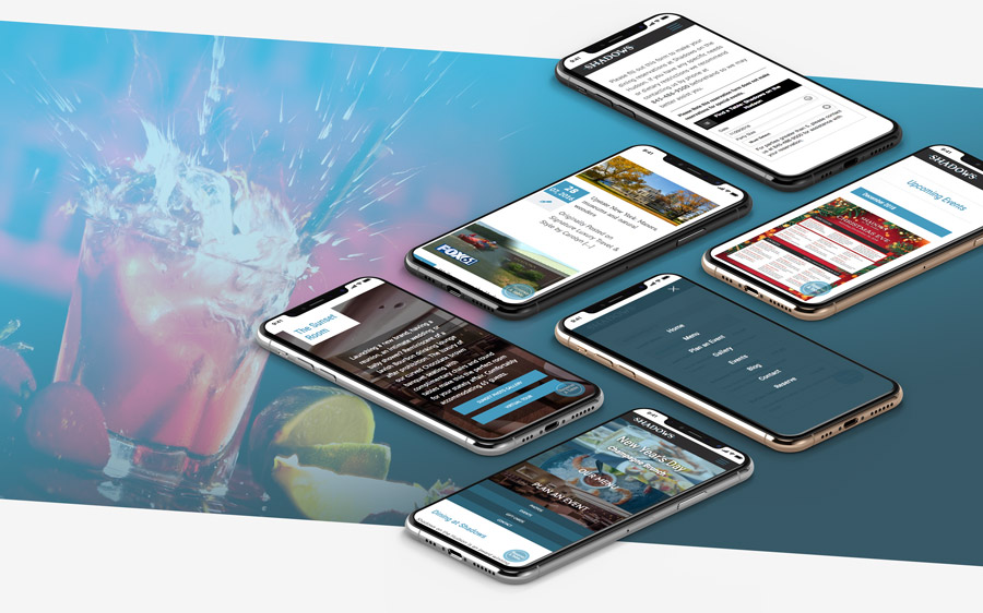
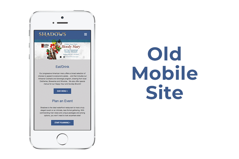
After a successful launch of The Grandview’s website, sister company Shadows on the Hudson, Poughkeepsie premier waterfront restaurant, was in need of a facelift as well. The current site averages about 22,000 visits a month from both local and out of town customers.
It is always exciting to work on an existing website because the research phase facilitated by all the data collected with Google Analytics. Year-to-date, the existing website sees 54% of its traffic from mobile devices, 36% from desktop, and 8% from tablets. Clearly, a mobile first design is vital.
Digging deeper, we find that the majority of visitors are between 25-34 years old with 55-64 year olds only slightly behind. Of these users, 65% are female, while 35% are male.
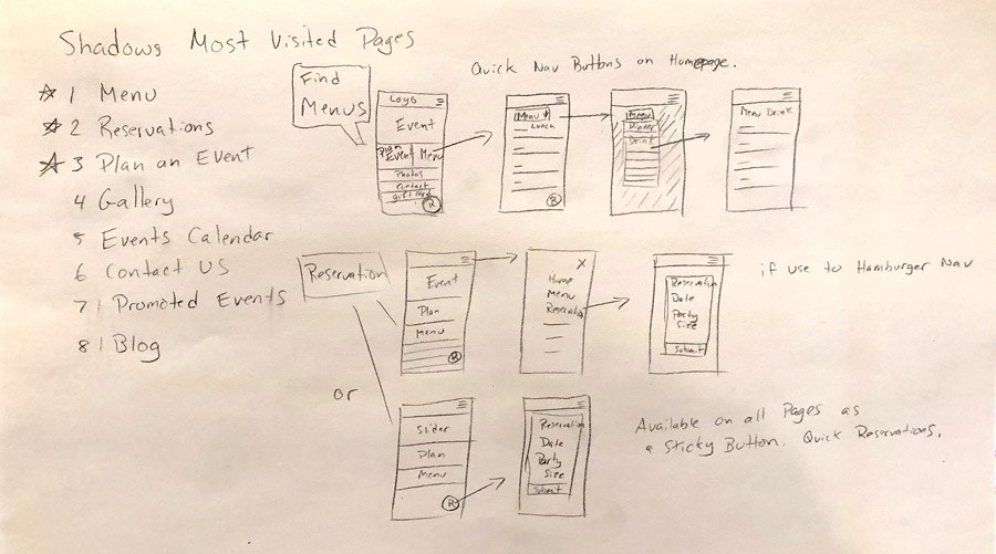
Users tend not to stay on the site very long. They want to see what’s on the menu, make a quick reservation, or see where they can plan an event. These 3 scenarios became the priorities, with other needs as secondary flows.
I decided to work on the reservation button first. On the phone, the average user is holding the device with one hand. Thus, for most, the easiest space on the screen to interact with buttons is the bottom. I placed the “Reserve A Table” button at the bottom right in a sticky div element. This became a global element within the site so that, no matter where the client is, they can always make a reservation.
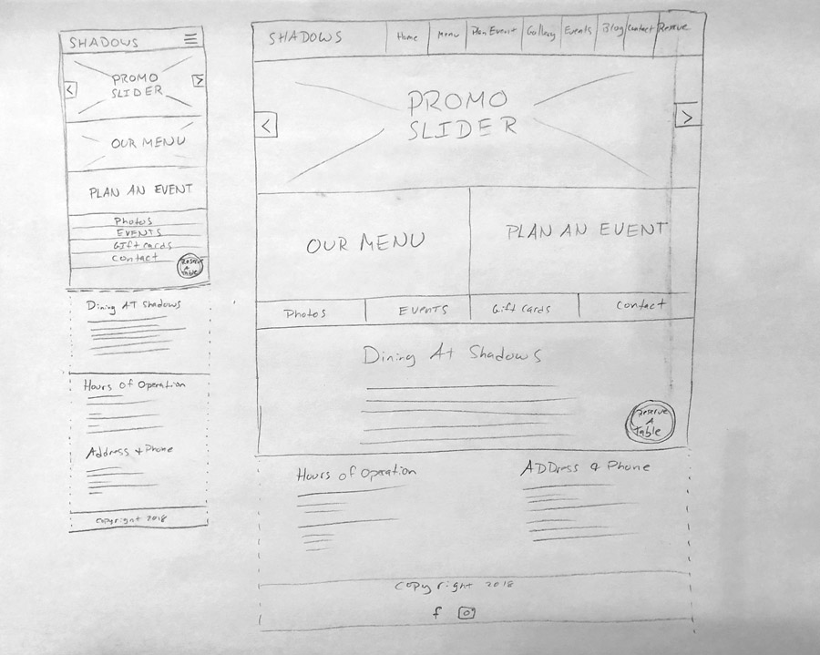
Rather than using a simple button, large responsive images with a text overlay as the buttons are used to attract the eye. These quickly allow users to get the information they need.
At the top of the page is a large slider element rotating through current promotions or events. These are clickable just like “Our Menu” and “Plan an Event” buttons.
Finally, towards the bottom of the screen, the remaining links are a quarter page wide, allowing for easy clicking and scrolling. For those familiar with the Hamburger Menu in the upper right, each button is available when clicked.
The full-button modular design easily brings the most important information to the users’ attention, allowing them to find, click, and go quickly. The “Reserve a Table” button is unobtrusive at first, but the second they scroll or visit a new page it jumps front and center since its the only thing on screen that is constant and stationary.
In a short amount of time:
Page speeds increased 74% from the previous design.
Pageviews increased 22%
Users increased by 18%
::NOTE::
Over time we’ll have more data to report and better insights to make adjustments.