Category : UX Design, Branding, Website Development
Brief : Create a mobile optimized website that generates more leads to boost sales and reduce advertising costs
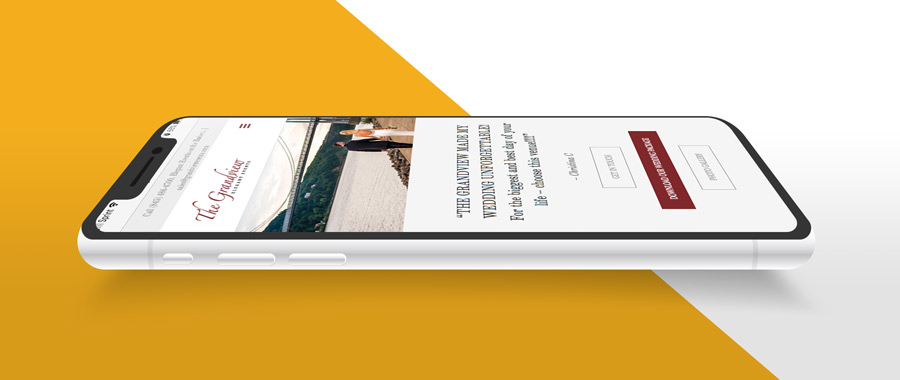
More Leads, Increased Speed, and A Fresh New Look
Like most small businesses, finding ways to cut costs while maintaining the same personal service they are known for can be a daunting task. With growth, it’s vital to standardize repetitive tasks, while still integrating with the overall workflow. The Grandview wanted to take a leap forward in their lead generation and conversion funnel by upgrading their website and workflows.
The Beginning
Before creating mock-ups and designs, we needed to discover the main goals for the redesign. The first step was to find the sales team’s pain points and nail down a target audience for the company.
Working alongside the sales team, we went through the current journey of the user as well as the sales person for a new lead. If the website were to bring more leads to the company, the sales team needed to be able to keep up with the demand. After these discussions, it was possible to set the goals needed to make this redesign successful.
Main Goals
Increase leads coming in via the website
Automate repetitive tasks to lighten the work load of the sales team
Match the clean look that most high end clients expect
Speed up loading times
Speed up communication to meet millennial habits
Other Goals – “Would be nice if possible…”
Build the site as a tool that can be used by the sales team while they are discussing in-person as well as over the phone.
Keep the site’s photos up to date
Affordable solutions to save money
LEADS
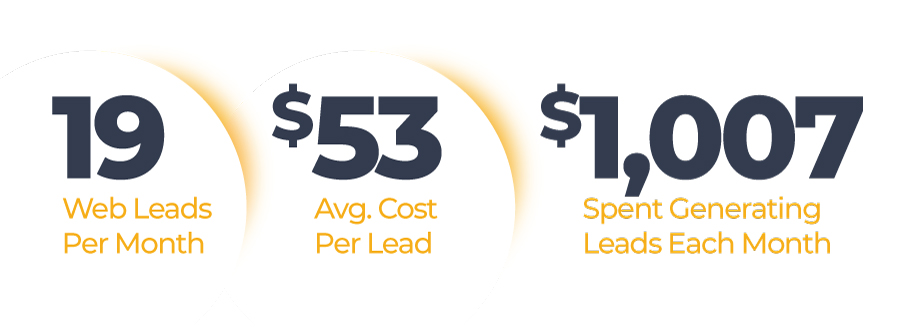
Google Analytics, revealed that one of the most visited pages was their package download page. On average, the website would deliver 19 leads per month. Breaking down the amount of money spent on advertising, the cost per lead was about $53: each month The Grandview was spending over $1,000 on website leads.
The problem meant users were finding the site, downloading package info, and leaving without sending a message!
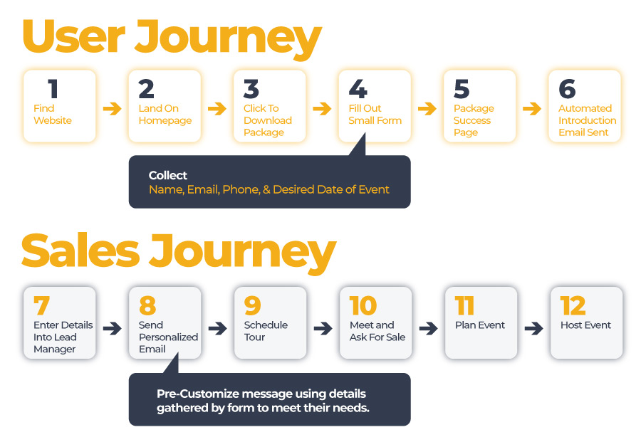
I redesigned the flow of this process to add value for the stakeholders while at the same time, maintaining the users’ overall experience. Now, in order to download their packages, the user is asked to fill out a small form that includes basic information: name, email, phone, and date of the event. This information not only allows the sales team to follow up on the lead, but also to customize their own message to best fit the users’ needs.
Personization
Once the form is filled out, a Success Page is provided that utilizes a query string passed from the form. The Success Page personalizes the experience with the client’s name to thank them for their interest and to supply them with all the content they requested.
An Issue Emerged
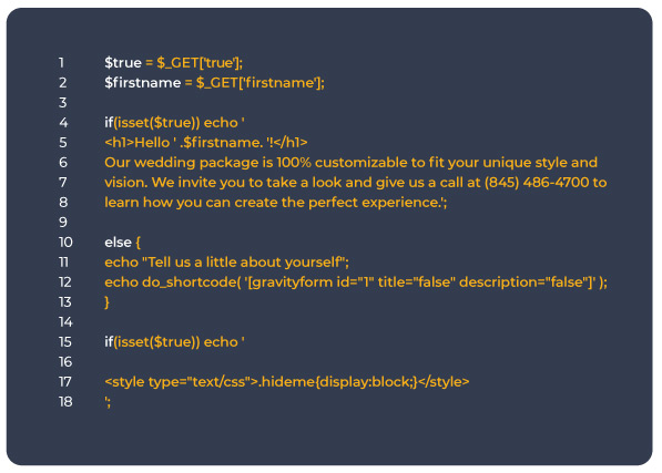
In order for this page to function successfully, it needs to be public. Someone with a simple google search could potentially find the page and download all files.
Rather than password protecting the page, a second query string was added to display true or false. Now, thanks to some custom PHP, if the string were passed, the page would display as usual; however, if someone managed to land on the page, they would instead see the same form asking for their information. SOLVED!
Finally, to round out the experience, the website sends a customized email with more information, including a link to the page with the same query string. This way, every time a client visits the site, they get a personalized experience.
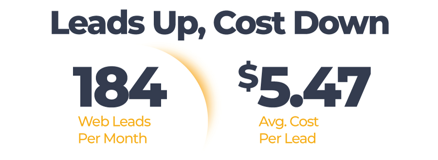
This user flow and form was a major success in increasing leads.
184 in August 2018
189 in September 2018
163 in October 2018
If we apply the same monthly advertising cost of $1,007 that previously produced a monthly yield of 19 leads @ $52 per, each lead now costs the company approximately $5.47.
A New Look
Re-designing a brand’s “feel” is a difficult task. 10 years of experience working as a graphic designer has taught me that one small change in color or style can throw off a brand, not only to clients but to the staff as well. Before developing a new look, it was vital to invest the necessary time with stakeholders to gather input in developing the new look and feel.
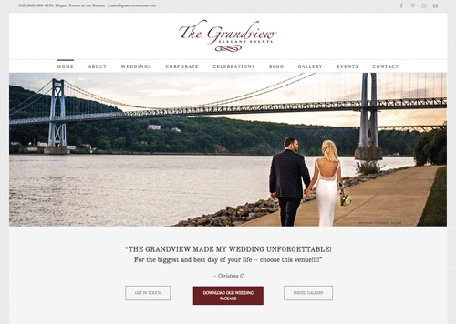
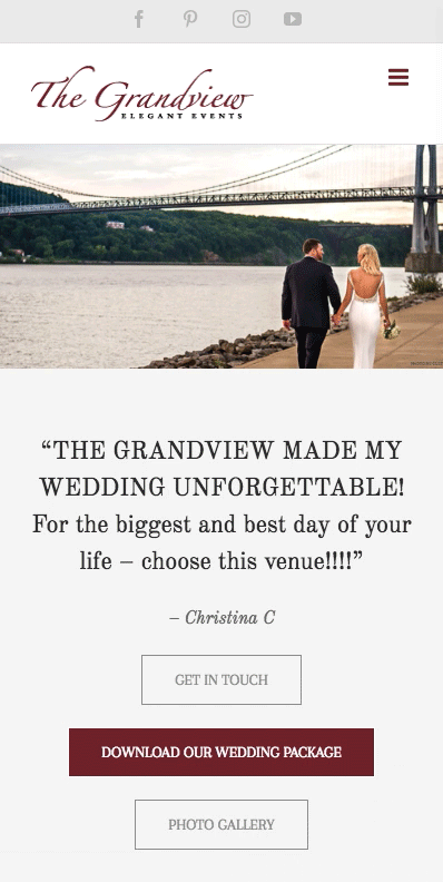
Originally, The Grandview website was dark, with a few pops of color, featuring large images, videos, and white text. While it had an edgy look, it was also very congested and was not the easiest website to read or navigate.
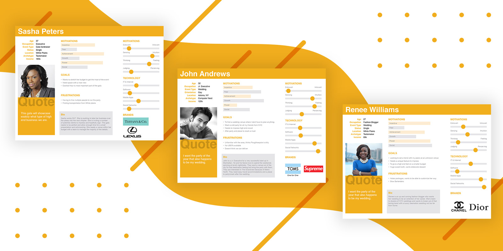
An important part of our discussion was the types of clients that Grandview had worked with in the past, and we began to create personas to fit them, as well as new personas for the clients they hope to attract in the future.
We narrowed the personas down to 3 that we needed to focus on, with the main persona being affluent couples from NYC/Westchester looking to host their wedding in a luxurious and private venue outside the Big Apple. Other personas included businesses looking to host a corporate event and people looking to host celebrations, such as Sweet Sixteen parties and Proms.
Using these personas, we were able to better understand the needs of their clients and discover what other websites they tend to visit, as well as the types of brands they generally support.
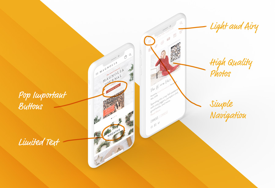
We selected 2 brand websites as our “Design Inspiration”
Both websites have a similar style of white with a subtle hint of color, along with plenty of negative space, and a mobile-first design.
With these sites selected as our look and feel, I began the design process. Due to time restrictions, the “sketching phase” was brief, and we jumped right into Photoshop. Mimicking major elements from our inspiration sites, we were able to focus on the user’s flow through the site, allowing secondary elements to fall into place.
I reorganized the navigation and selected not to use drop-down menus for any section, making it easier and more convenient for mobile users. Unlike the previous site, page content is now presented in a linear, story-telling style, introducing links as they come up according to the page hierarchy. The most sought after information resides at the top for fast access; tertiary content is available as the client scrolls deeper.
Load Times
The new site design played a major role in speeding up the load times for each page as well. Previously, the website’s homepage was filled with browser heavy extras, such as full-screen background videos, large images, embedded YouTube videos, blog posts, events, and more, a classic case of more being less. Users would normally click the first few buttons to go deeper into the site, skipping the resource heavy sections on the homepage. To resolve this, we stripped the homepage of all secondary information and focused on essentials the user is looking for.
These changes, along with an updated and optimized WordPress installation, increased the page load speeds from 10.33 seconds to 1.79 seconds, a 82.68% speed boost. On mobile devices, that might as well have been an eternity.
Communication Breakdown
Rather than seeing these leads sink like the proverbial Lead Zeppelin, there needed to be an affordable way to communicate with the millennial generation. Millennials tend to do most of their communication via their smart phones — mostly texting. In looking into marketplace text for business solutions, there were significant issues with all options in terms of how they would integrate with the sales team on a day-to-day basis. They were also fairly pricey.
The best solution seemed to be Facebook’s new messenger integration tool. This lightweight add-on was free, and it simplified the process for the team. Anyone who was an administrator with the business Facebook page could respond instantly, using their own computer or mobile device. Auto reply messages were also set up for when the staff was unable to respond immediately.
Now, users and staff are able to quickly communicate and turn simple chats into leads.
Site as Sales Tool
One scenario that occurs quite often is a potential client wants to tour the venue but they don’t live in the area. These cases usually occur when our couple lives far away but wants to get married in their hometown, to make it easier on all the guests attending. Photo galleries are great, but still limit the experience. This is why The Grandview and I set up a Google 360 Tour.
A certified Google photographer takes a number of photos and stitches them together similar to a Google street view. This allows people to virtually tour the facility. However, there was still one important issue, the virtual tour can be a bit complicated for non-tech savvy people. To combat this, I created a page on the site with an accordion-style navigation, each showing a different start point within the venue. This allows users to easily “walk through” the venue with the sales person over the phone.
Site Up To Date
Another request was to provide a way for the sales team to add photos to the website without needing to know how to code. Using WordPress, I had assumed I could teach them basic flows to upload and place images. However after discussing the pros and cons with the team, I opted to use a plugin that pulls the latest photos from their Instagram feed. I customized the plugin using CSS to strip it down to only show the photos and styled them to look similar to our photo gallery. This way the staff can instantly add images to the site using apps they are already familiar with.
Affordable
After everything was said and done, the redesigned website now saves The Grandview money every month. The redesign freed up more server space and prevented GPU overage charges imposed by their previous site. No additional services were needed to accomplish their business goals. In addition, thanks to the increase in website leads, every month the company saves a significant amount of money on advertising costs.
 Rather than password protecting the page, a second query string was added to display true or false. Now, thanks to some custom PHP, if the string were passed, the page would display as usual; however, if someone managed to land on the page, they would instead see the same form asking for their information. SOLVED!