Website design has somehow survived a roller coaster ride of styles, techniques, and tricks dedicated to the flashy and memorable. The problem is that, over time, we have become numb to catchy visuals, tempting phrases, and edgy layouts that do little more than muddle the message and get in the way. Today, websites need to be designed content first. And they need to be fast.
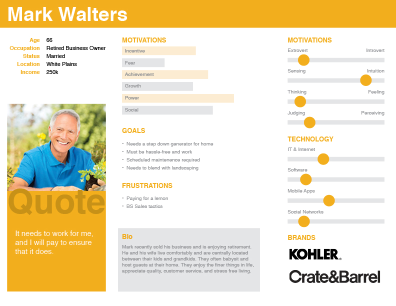
With a positive opinion of 69%, Kohler is more popular among baby boomers than any other age group. Kohler is also equally popular among men and women.
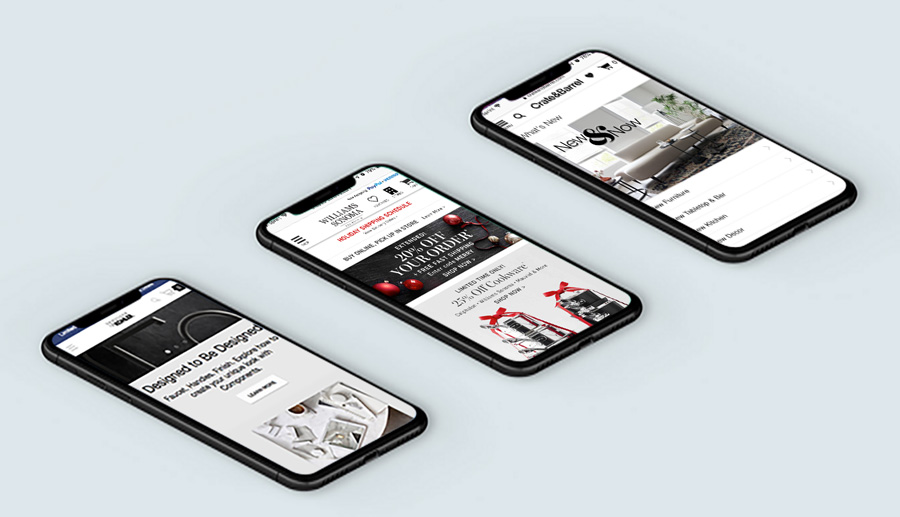
My research brought me to a number of websites that our user would potentially visit. By navigating through each site, I found similarities, including use of negative space, color choices, and large imagery with overlaying text. Also, with large buttons above the fold, the most popular pages were easy to navigate to without having to click the navigation menu.
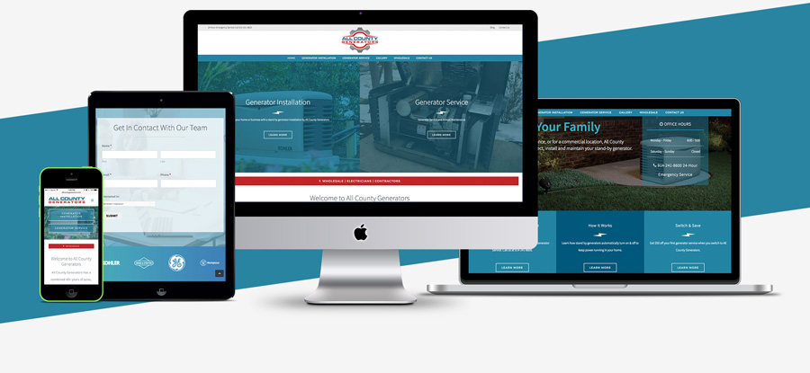
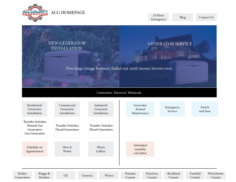
All County Generators has two sources of revenue: new generator installations and annual maintenance. My goal was to make each easy to find and to organize content logically within each section. To better explain the concept to my client, I developed a visual flowchart. The site also required secondary elements on the homepage for quick access, including “24 Hour Emergency Service” and “Wholesale for Contractors.”
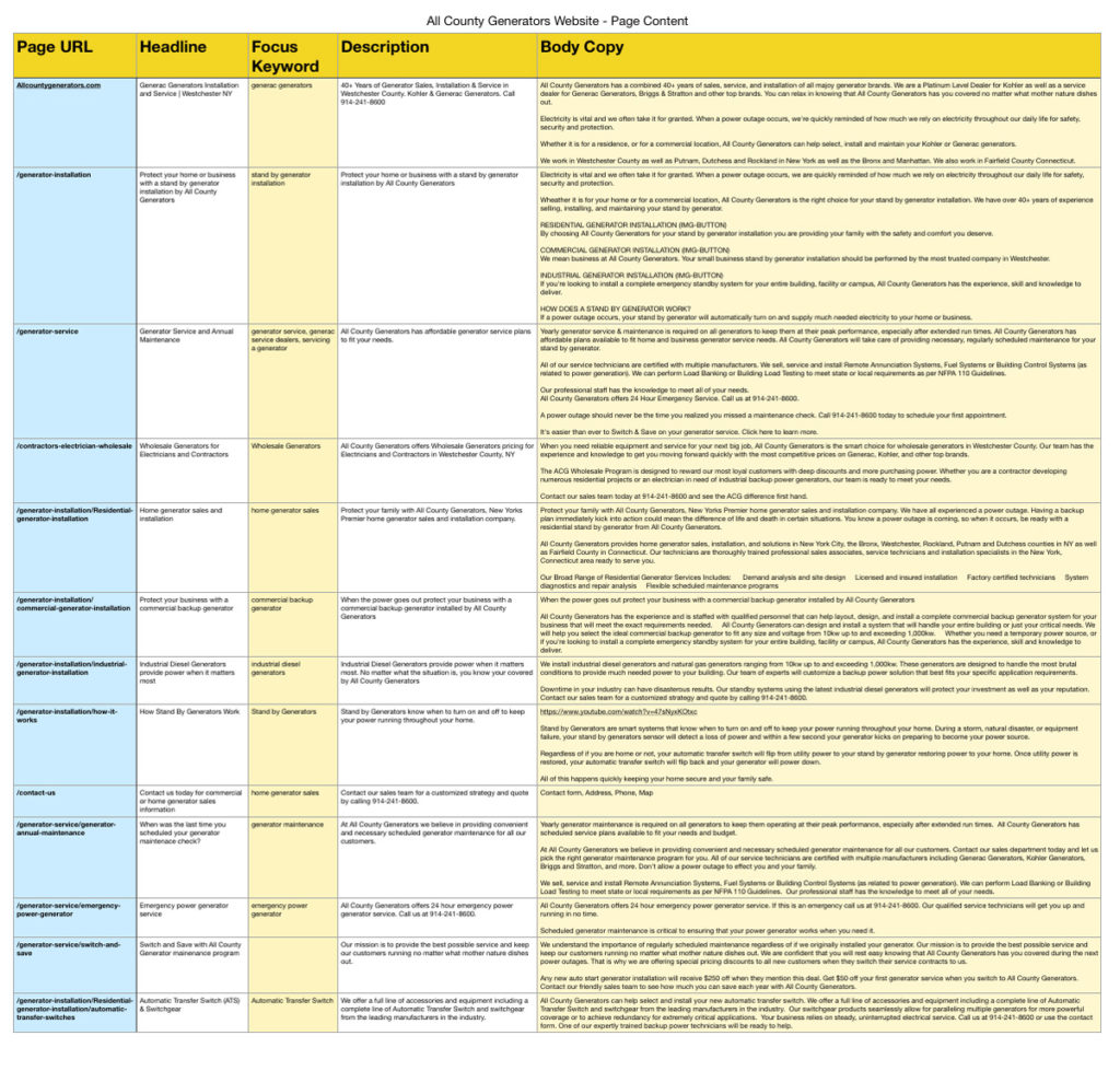
For SEO purposes, I created a spreadsheet to contain the body copy, along with focus keywords, headlines, meta descriptions, and the page URL.
The first few seconds are crucial: they determine whether a prospective client stays or goes. Knowing this, the moment someone visits AllCountyGenerators.com they are given 3 quick links: Generator Installation, Generator Service, and Wholesale. For emergencies, I also included quick ways to establish immediate contact. Once they’ve navigated into each section of the site, users are presented a separate set of choices based upon possible needs. This keeps users engaged with the task at hand and helps guide them to finding their answers and connecting with the sales team.
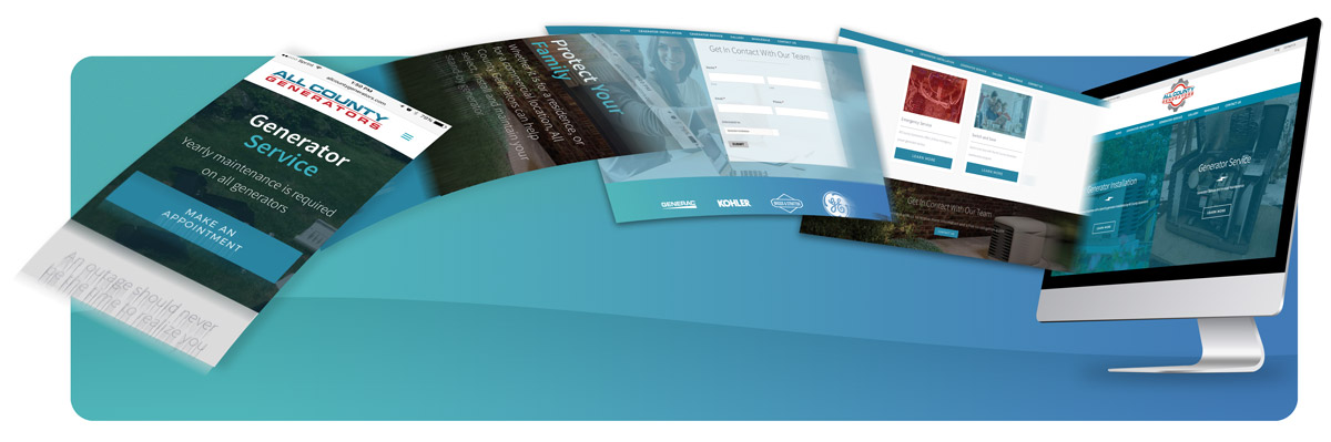
From my research of similar company sites, I knew that I would need to include larger images. However, because this is a smaller generator company, there is no budget for a Content Delivery Network (CDN) to serve our images. Instead, I selected Photoshop to add the branded blue color as an overlay on the image. When saved for web, this helps shrink the file size of the image by decreasing the amount of colors needed in the file.
By taking the time to research our users and their preferences, developing a visual flowchart, and creating content with focused keywords, I was able to launch a successful site for a smaller company that could compete with the established competition.
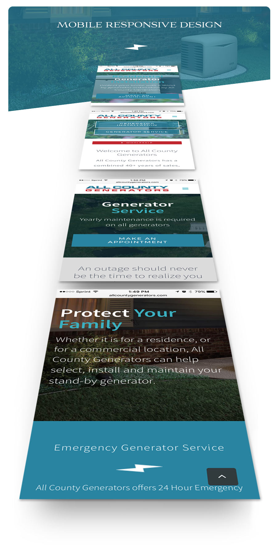
Mobile friendly designs are far more important than designing for desktop. More tech-savvy people are visiting sites while on the go, and they want the solution to their problem now. They have no time to wait. After mere seconds of visiting your link, if the site doesn’t load, say goodbye to your precious lead: the prospective client is already two sites away. This is why I developed this site with speed as the #1 priority. Using a responsive framework and simple flat colors, mobile browsers can render the site quickly, and your visitor can get in and out with the information a future customer needs.
Despite the design limitations required for a speedy site, there are still creative solutions to make your site stand out. By using solid color blocks to separate information, content can be organized in sleek, simple ways. Large images can still be featured without inhibiting the user. It is important to compress files using Photoshop or other image compression software and to strip away any unnecessary information that can slow a positive process. When featuring larger images, I recommend using them below the website fold so that, as they load, they do not unnecessarily impede or obstruct the user experience.